


If you think the fonts you select for your business won’t impact your bottom line, think again.
Font is one of the most important design elements of your webpage, business cards, and other media you use to communicate to clients and prospects. It may seem like a waste of time, but making the effort to research the fonts for your website can make a big difference in the number of conversions you get – or don’t. Why? Because research has shown that people actually react to different types of fonts on an emotional level.
Pick the right one, and you’re more likely to make a connection, gain trust, and ultimately earn visitors’ business. Choose a “bad” font, and people may click away without even reading what you have to say, let alone follow through with an action.
Font’s Impact on How People View Your Business
Take a look at the following sentences:

What kind of party did you picture yourself going to for each different font?
You might have pictured a child’s birthday party for the first, a fancy dinner party for the second, and some sort of themed party for the third. Each font gives the reader a different impression of the content they will read as well as an impression of the author of the message.
This same concept applies as you invite readers to learn more about your business. If you are writing in a more serious font, your readers will assume you are a more serious business. If you are writing in something playful, like Comic Sans MS, they may not take your business as seriously. Tailor your font choices to what visitors want to see and feel comfortable reading.
Beyond your reader’s general impression of your business, fonts can help your readers respond to your calls to action and, consequently, drum up more business.

Psychologist Kevin Larson of MIT conducted one of the most noteworthy studies regarding font usage and emotion. Larson gave groups of people different pages of The New Yorker. One had clear, well-designed typography. The other… not so much.
What he found shook the world of typography, and also confirmed many designers’ intuitions about the importance of a good font. After reading their page from The New Yorker, participants rated the pages using the following criteria:
- The text was easy to read.
- The page layout looked like a magazine.
- I felt like I had control.
- It was easy to get where I wanted to go.
The group given the poorly designed layout had more trouble navigating through the content, and some participants expressed their mood physically by frowning. In the meantime, the group exposed to the good typography felt it took less time to read the document and felt better. The consequent good mood they were in allowed them to sustain increased cognitive focus, conduct mental processes more efficiently, and show an enhanced sense of clarity throughout the experiment.
The criteria above are extremely important to your businesses when you consider the design of your website. If you write and design your site for clarity and ease, it will be especially easy for your readers to stay on your page, navigate your website, and learn more about your business. There will be fewer miscommunications because your readers will better understand the message of your site and be more likely to pay attention while reading.
When readers feel in control, they feel confident. Consequently, good typography will make readers feel confident in your business. This will make them more likely to pick up the phone and give you a call, or respond to whatever call to action you suggest on your website.
How to Choose the Right Font for Your Business

Okay, so you know that fonts are important. But how do you choose? What fonts are out there? Should you use different fonts for your title, headers, sidebars, and so on?
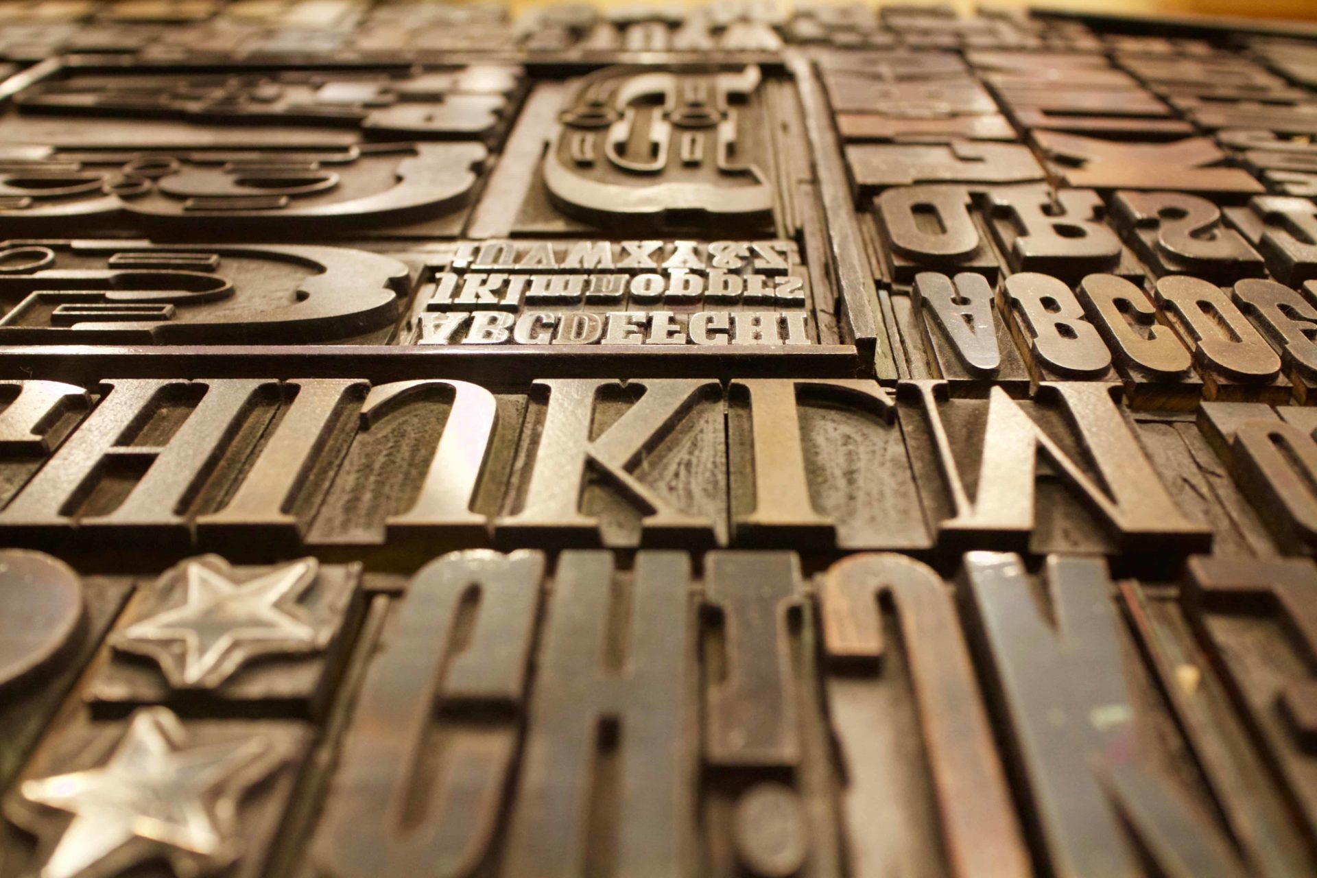
Let’s answer that second question first. How many fonts exist? Hundreds. Thousands, even. And people create more of them every day. But many are “specialty” fonts that no business should ever use.
To understand why, we’re going to take a look at the four categories that fonts are typically broken down into. Each category gives your readers a different impression and serves a different purpose.
Serif. Serif is a classic font style that is defined by having “serifs.” Makes sense, right? But what are serifs? They’re the little projections or embellishments you see on the edges of each letter. These fonts are typically considered more appropriate for print media, and they are often regarded as more “serious” than other types of fonts.
Common examples of serif fonts include Garamond, Baskerville, and Cambria.
Sans Serif. As fonts evolved, more and more people did away with the classic serifs, making them sans (or “without”) serif fonts. Without the serifs, these fonts tend to look simplified and open. Generally, it is easier to recognize and identify each letter. Sans serif fonts are recommended for both digital screens and text that will be read by younger readers.
Common examples of sans serif fonts include Helvetica, Arial, and Verdana.
Script. These fonts look more handwritten than the fonts we see every day on our computer screens and in our books. Script fonts can be formal or casual. They are not typically recommended for general business use, because script fonts in the body of your website can look claustrophobic and may turn off your reader.
That being said, fonts in this category can sometimes be used for titles or important headings – but only if your goal is to convey a particular feeling or mood.
Common examples of script font include Brush Script, Handwriting, and Papyrus.
Decorative. Like script fonts, decorative fonts are not recommended for body text and for mostly the same reasons. But that does not mean they should be ignored completely when designing your web page. Decorative fonts serve specific purposes and can stand out to catch your reader’s eye.
Common examples of decorative font include DK Cryaon Crumble, Curlz MT, and Marker Felt.
Think You’re Ready to Choose a Font?
Not so fast. Once you’ve found a font you like, it’s time to step back and do some research.
Start by learning the history of your font. This means figuring out where the font has been used before. Your readers may subconsciously associate your font – and therefore your business – with other organizations, businesses, and even individuals who have used that font before.
Additionally, check to make sure that font is available for a wide variety of devices and platforms. Are you using a Mac? PC? Android? iPhone? What about your readers?
Unfortunately, few fonts are available on every platform. Fonts that are versatile are often referred to as “universal” or “web safe” fonts. Here is a list of those fonts:
Arial, Arial, Helvetica, sans serif
Arial Black, Arial Black, Gadget, sans serif
Comic Sans MS, Comic Sans MS5, cursive
Courier New, Courier New, Courier6, monospace
Georgia1, Georgia, serif
Impact, Impact5, Charcoal6, sans serif
Lucida Console, Monaco5, monospace
Lucida Sans Unicode, Lucida Grande, sans serif
Palatino Linotype, Book Antiqua3, Palatino6, serif
Tahoma, Geneva, sans serif
Times New Roman, Times, serif
Trebuchet MS1, Helvetica, sans serif
Verdana, Verdana, Geneva, sans serif
Symbol, Symbol(Symbol2, Symbol2)
Webdings, Webdings(Webdings2, Webdings2)
Wingdings, Zapf Dingbats(Wingdings2, Zapf Dingbats2)
MS Sans Serif4, Geneva, sans serif
MS Serif4, New York6, serif
As you can see, most of the “universal” fonts are either serif or sans-serif. Most of the others consist of symbols that you most likely won’t be using for your site.
If you want to use a font that isn’t on this list, do a test run of your font by viewing your website on different devices and platforms. A unique font may not give the same impression or have the same appearance on each platform. Make sure you’re okay with how it is going to look on each and every platform.
Do you Need More Than One Font?

One quick tip if one font isn’t enough:
Just like we use headings, titles, and columns to separate different types of text, we can also use multiple fonts to break up or highlight different parts of our website. It’s important, however, to choose fonts that will complement each other.
I love this tip from Smashing Magazine: If you want to use a different font to highlight a header or different texts, go for one that sharply contrasts the website’s overall font.
Choosing a font that’s basically the same as another one you’re using looks goofy, and it also doesn’t highlight the text in the way that will properly catch the eye of your reader. Ultimately, it will just end up looking messy and possibly confusing readers if they notice it.
In short: Avoid clashing fonts and seek out contrasting fonts.
You Don’t Have to Take Our Word for It
We’ve only begun to dive into the world of typography. For more information, check out the following resources:
- A pretty obvious resource for using fonts, com allows you to download, use, and learn about the common uses of different fonts. Check out an expanded version of our classifications of different fonts here.
- If you’re on WordPress, it may be beneficial to explore the WP Google Fonts plugin. It lets you access the full Google font directory and pick the perfect font for your website. Pretty nifty.
- For some font pairing inspiration, head to co to find pairs of different Google fonts that go well together and don’t fight the reader’s eye for attention.
Your Font as a Key Ingredient in the Overall Design

Remember, the font you choose is just a part of the experience. Larson’s study noted that text that was part of a well-designed layout was easier to read. Moreover, it took readers less time to take in and comprehend the text in front of them.
As your potential clients browse through your website, it is important to communicate as much information to them as possible, as quickly as possible. Our attention spans are short. This is especially true when we have multiple tabs open to look at businesses that offer similar services!
To maximize your conversions, make sure your site is the easiest to read and understand.

David Faltz
 Everything You Need to Know About Mobile SEO for 2017 & 2018
 Why Businesses with WordPress Sites Should Consider WP Engine (A Totally Biased Review)