


Rumor has it Google may add mobile user experience to its algorithm rankings in the very near future. If it does, it will come as no surprise. As internet users quickly transition from desktop searches to mobile queries as their preferred method of browsing, webmasters are being asked to adapt to these changes.
As of July 2013, Google started changing their ranking system to negatively affect sites that contain errors in configuration for smartphone users. They are currently evaluating how to analyze the overall mobile performance and include that information in search engine rankings alongside traditional website performance.
Over half of all online searches originate from mobile devices now. It is no longer part of a site’s online presence that can be more or less ignored. Having a successful mobile site can still give a business a competitive edge while other companies’ mobile sites are in development. Furthermore, 70% of mobile searches result in website action in an hour.
The Mobile User Experience
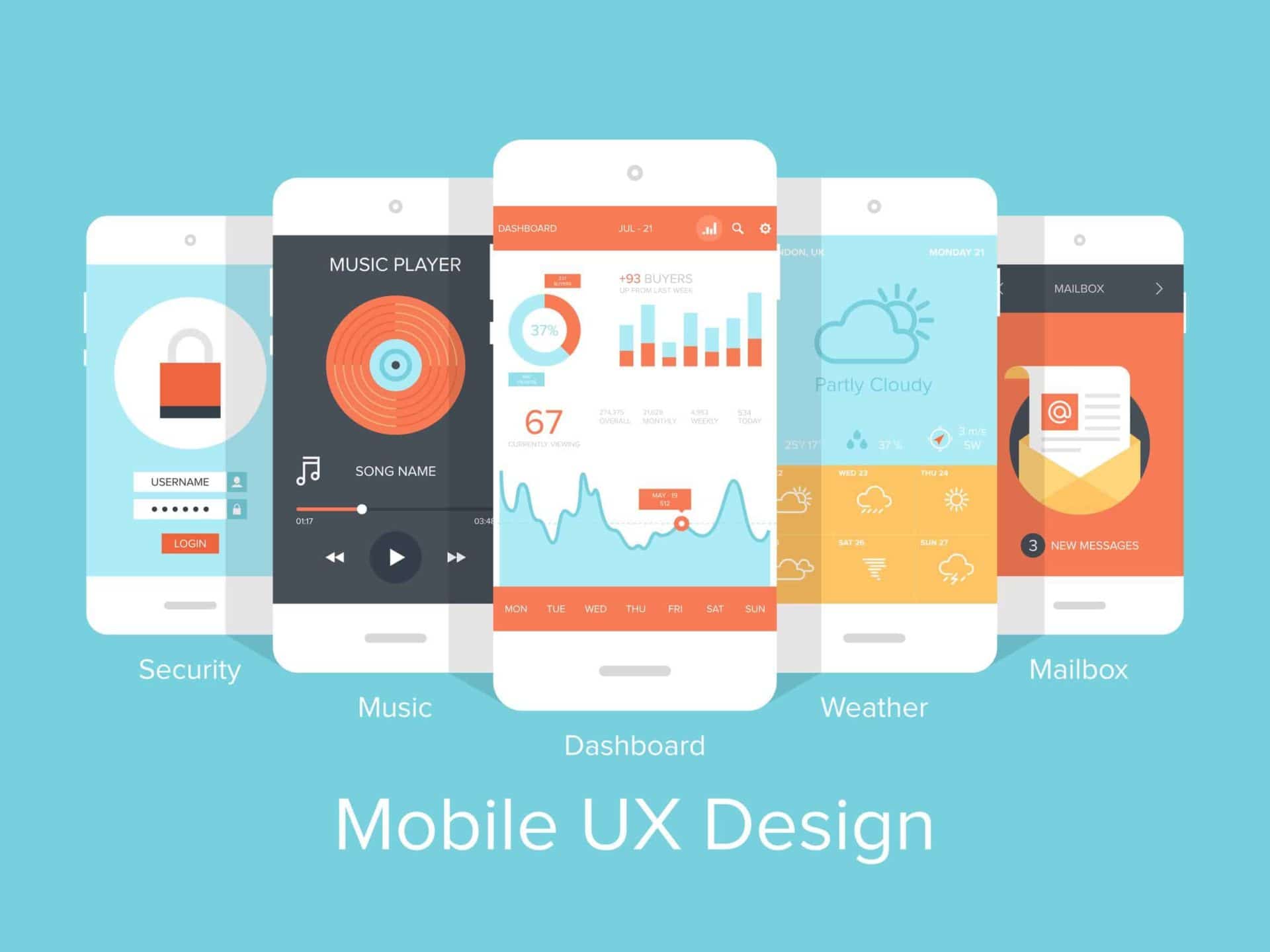
User experience for any product involves all the senses and perceptions that come with the interaction. Mobile device screens are smaller than computer screens, so content has to be compressed and organized in a way that is digestible for the viewer.
Every consideration for a mobile site must be user centric. People with smartphones check their devices an average of 150 times per day. Streamlining the design and usability of a site increases the chance that user will come back to the site.
When a company decides to go mobile with their brand, mobile websites can be built separately or as part of a responsive design. Both methods have pros and cons and should be evaluated on a case by case basis.
Separate Mobile Website
While more cost effective, a separate website for mobile devices will only work on phones. Tablets would require yet another site. They are good for companies that want to condense a website for mobile use, and the design work does not require specialized coding expertise. A separate website can also look similar to the desktop version, without including all the information that the desktop version offers.
Responsive Web Design

Responsive web design (RWD) creates one site that is dynamic for optimal viewing across multiple devices. A fluid grid, media queries, and responsive images are the main pieces of creating this type of design.
RWD makes tracking SEO and marketing campaigns easier by collating the data from one site instead of two. It is better for SEO than maintaining two separate websites, and Google recommends RWD for creating the best user experience. Having the same HTML and web URL makes it easier for Google to analyze, as well.
Major Elements of and How to Improve Mobile Designs
To create a user experience that is smooth, effective, and seamless consider the following:
- Navigation. Use fluid navigation that will move from top to side of an open browser depending on the device used.
- Labels and forms. On a mobile device, any field that requires input should be aligned vertically and large enough to click on for ease of use.
- Navigational notes. Utilize cues that help a user scroll back to the top of the page or home buttons to navigate back to a landing page.
- Columns. Columns are also beneficial as part of an RWD, allowing a site to resize itself based on the size of the browser window. One column may suit a mobile phone, whereas 3 or 4 columns may fit easily into a computer browser. A separate mobile website can be arranged according to the mobile screens it will be viewed on.
- Brand visibility. Designers should make sure that when the screen size changes, the logos and brand images are similarly reflected.
- Strategic use of white space. A user should never feel that a page is squished with too much content. Even though the traditional site and mobile site are the same, the information should be presented in a visually digestible manner. Different designs may be needed for different device viewing needs.
- Maximize the call to action. Consider making these clickable buttons large, easy to click, and distinctive in color or design.
- Content. Content on both a separate mobile website and an RWD should be considered for its ability to be quickly scanned and digested. Add social media links or appropriate links to apps for the user to transition between sites and applications easily.
- Security. Mobile users are concerned about the privacy of their actions on mobile devices, and users should have control over sharing their information in an app or on a site – including GPS/location data. Everyone treasure their privacy, and ignoring security preferences or not being transparent about certain features can be destructive.
- Feedback. Alerts, notifications, badges, and other feedback information that can be provided on a mobile device should be relevant, easy to navigate, and nondisruptive to the user.
More Information
Targeting your primary users will inform which kind of site your company should invest in. The answer may be both. Keep everything simple and clear with task-based designs that are large and easy to navigate. Options for application or mobile website support should be easy to access. Any new features or reorganization should be contextually introduced to a user with instructions that can be skipped or scrolled through. If a mobile site is separate from the traditional site, shorter URLs will make it easier to find.
Consider the appearance of your site on all devices. Tablet and smartphone brands have unique swipes, buttons, and other navigational features. Having a site that caters to those expectations will make it easier to navigate. Before launching a site or making any updates, use a program to view how the site will appear on a given device. Google uses Googlebot to see exactly what a user will see in real life.
After your mobile site is up and running, treat it as an ongoing project, constantly learn from feedback you receive using analytics and your own experience, and continually make improvements.

Sources:
http://searchengineland.com/google-search-ranking-changes-to-auto-correct-your-mobile-seo-mistakes-162826
http://www.adknowledge.com/blog/statistics-to-justify-budget/
http://blog.marketingninjas.com/blog/the-importance-of-responsive-website-design-infographic
http://searchenginewatch.com/article/2184616/Responsive-Web-Design-Introduction-Impact
http://blog.crazyegg.com/2011/11/14/responsive-web-design-elements/
https://econsultancy.com/blog/63513-10-simple-tips-for-improving-mobile-form-ux#i.qrt9t21eg5di91
http://www.smashingmagazine.com/2012/07/12/elements-mobile-user-experience/
https://www.redant.com/articles/ten-tips-for-mobile-ux/
http://searchengineland.com/google-may-add-mobile-user-experience-ranking-algorithm-205382
David Faltz
 Everything You Need to Know About Mobile SEO for 2017 & 2018
 Want 2017 SEO Success Factors at a Glance? Check Out This “Periodic Table”
 The Right Font Matters – How to Pick It
 Why Businesses with WordPress Sites Should Consider WP Engine (A Totally Biased Review)